Here’s what you need to know about where design is headed in the future.
Trends in design, fashion and architecture tend to be transient and roughly follow a 20-year cycle. What is old will likely become new again.
But some drivers of change in visual design are likely to be more permanent. The global thirst for data and information is altering the landscape. Here are our top 4 drivers of change in visual design.
1. Data Visualisation

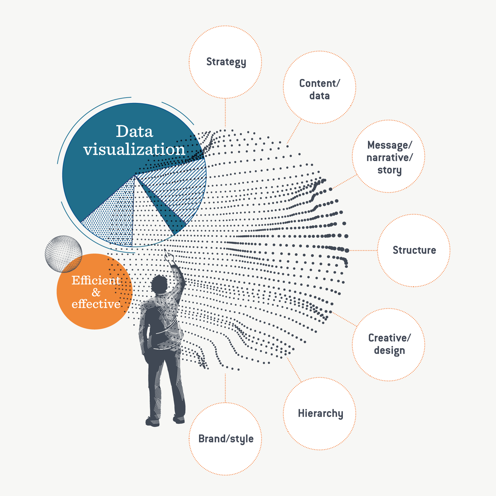
The amount of data available for businesses to process and collect is growing exponentially. Big data and meta data are enabling companies to better understand their customers and stakeholders and tailor their offerings. Being able to effectively interpret and communicate this complex information is vital.
The need for effective communication of data has led to the development of a raft of tools for creating engaging data visualisation. For example: infogram; Datawrapper and larger platforms like Tableau offer visual analytics for enterprises.
These tools are great for visualising chunks of data, but it’s important to keep in mind how visualisation helps tell a better story. A glance at sites like like datavizproject.com and data-to-viz.com show some of the options for presenting information well. But the key questions to ask are, is it engaging and is it telling a story? After producing well over 1,000 data visualisations, we understand the importance of showcasing the underlying business strategy, presenting a clear narrative structure and smart design.
When designed well a good infographic is worth a thousand words.
2. Motion and interactivity

We live in a dynamic online world. This means that grabbing attention is increasingly becoming the metric for assessing the effectiveness of design. Not surprisingly, research is showing that motion drives up to twice the engagement rate as static images. As a result, many marketers are choosing video and motion over static images. Along with increased engagement, more of the story is communicated than if a static graphic alone is used.
This means we’re seeing an increase in explainer videos and website integration. Motion has always been an important part of the user interface, but more than ever, motion design will inform users, validate their interaction and focus their attention. Google’s Material design is a set of best-practice principles for designing a consistent system of moving interactions.
3. Sustainability

Much of the thinking around sustainability in design has traditionally been about printing on ‘brown paper’, or using recycled packaging, but this is changing fast. Sustainability is now a much bigger and more complex issue and design has a large role to play in supporting it.
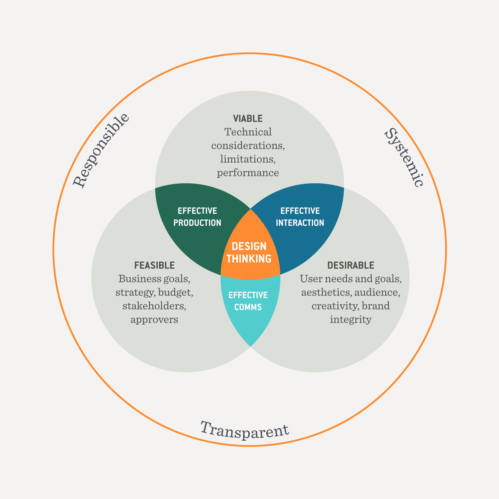
A recent trend is planet-centred design. This represents a more holistic framework for looking at design’s impact on the planet. It’s about innovation, circular economy, certifications like cradle to cradle, and embracing a systemic, responsible and transparent design process and perspective.
We’ve had the privilege of working with many companies on their sustainability strategies and communications. One of our favourites is the 2021 Canon Sustainability Report. We used Canon’s material topics, deemed critical to the company’s long-term success, to structure and inform the report. Given the company’s pioneering role in the development of photography, a visually stunning report was a priority. Feedback suggests we delivered, with stakeholders remarking on the beauty and clarity of our design, writing and data visualisation.
4. Accessibility and inclusivity

Good design has always been about delivering a clear message to your audience, and it’s now widely recognised that inclusivity and accessibility should be an integral part of the design process.
Accessibility and inclusivity are obviously not new ideas. Web standards have been around for a long time with the W3C Web Accessibility Initiative, but they’ve often been used for oversight of issues like colour contrast on government and other websites. However, the benefits of being accessible go way beyond this. The Centre for Inclusive Design recognises the value of design which connects with all people and helps to enable users to interact with the world.
The importance of accessibility and inclusivity are front of mind in all our projects. Photography also represents a wonderful opportunity for inclusivity, as we demonstrated in Ausgrid’s 2020 Sustainability Report. The report features beautiful portraits from a diverse group of employees, highlighting the passion Ausgrid’s people share for a cleaner and fairer energy future.
In conclusion
Ultimately, technology will continue to play a large role in evolving the design landscape. But we must take a holistic approach to design that includes data, motion, sustainability and inclusivity to ensure we make the field as a whole even more useful and relevant for designers and users alike. These factors will drive the overall direction of design into the future, while the cycles of what’s considered to be ‘old’ and ‘new’ continue to evolve.

